

Fall fashion runways revealed a spectrum of colors ranging from traditional earthy tones to a very feminine pink and an eye-opening blue. The Pantone Color Institutes helps us put a name to each of these hues, and we’ll give some tips on how you can incorporate these colors in store.
Ballet Slipper refers to the unexpected but welcomed oh-so-soft pink that made its way onto the runways. This is a soothing, calming color. It’s the perfect backdrop for undergarments. Drape a soft pink cloth over a display table and instead of pulling it taut, allow for soft folds on the tabletop. It will create an inviting setting for frilly bras, silk panties and other intimates.
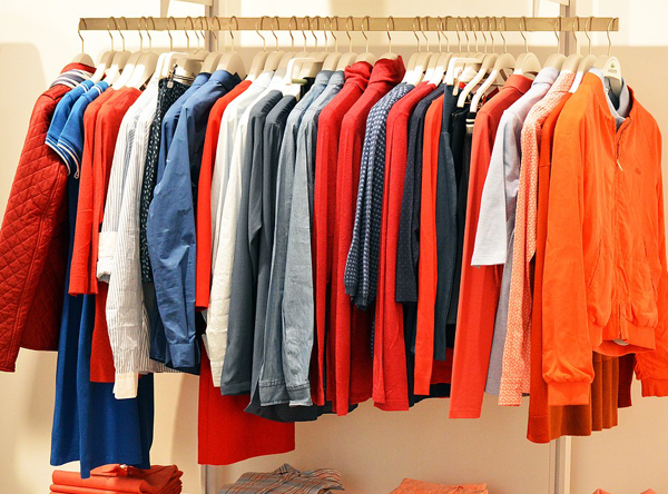
In retail, red is often associated with sales (“red tag” sale, for instance). This fall, it will be splashed across display floors in the form of coats, dresses, you name it. Instead of trying to minimize it, go with the flow. In fact, built upon it by accessorizing outfits with red jewelry, red gloves, even red nail polish and lipstick on the mannequins!
Like the beverage for which it’s named, Butterum is a warm brown hue. Use this neutral color as a background for signage. When topped with colorful lettering, your messaging will pop and be eye-catching to shoppers.
Neutral Gray is another middle-of-the-road color. Dress up gray displays with cubic zirconia and other costume jewelry.
Another traditional fall hue is Autumn Maple, a luscious golden brown. Be sure to accent these pieces with lighting to bring out the golden tones.
As you’d expect, Golden Lime is a yellow-green blend. But it’s much more than the color we associate with crayons. Deck out mannequins with blonde wigs as the perfect complement.
Also in the green family is Shaded Spruce. It’s the perfect alternative to the traditional green of Christmas décor.
Tawny Port, better known as burgundy, is a deep, rich color. At holiday time, forego the aforementioned red and opt for tawny accents. Think about adding velvet bows in burgundy to displays, either with wrapped gift boxes or simply by affixing bows to racks and other store fixtures.
While you’d never expect to see Marina in a fall color scheme, this perky blue is perfectly at home in your autumn product displays. Marina is unique in that it’s at once brilliant and calming. Place racks of Marina-hued wear in between the more neutral offerings to break up the monotony.
Navy Peony is another, albeit more subdued, member of the blue family. Use it wherever you typically would use black. Your customers will love the look.